
Regulated cannabis e-commerce & checkout design
A regulated cannabis e-commerce platform in the US market. Young and middle-aged adults come here looking for personal wellness — backed by a high-quality experience grounded in scientific standards, with a clear statement of protection and reliability throughout.
Results after 20 days 23,000+ users
Revenue per visitor increased: 38.74%
Conversion rate jumped: +14.47%
Project overview
This DTC business needed to earn trust in a category where visitors often arrive skeptical — is this legitimate? Is this legal? Is this safe? Positioning the product online meant building an entire digital brand presence — through a design system that used color, typography, and imagery to visually signal the product’s natural origin and scientific credibility, and a tone of voice that spoke to wellness rather than stigma.
-
USA

The problem
This regulated cannabis brand had no defined digital presence — no visual system to signal quality or legitimacy in a category where skepticism runs high. Key information sat below the fold, and no section built social proof. My challenge was to define that brand presence from the ground up — color, typography, imagery — while building confidence into every step of the funnel, from first browse to checkout.
Hypothesis
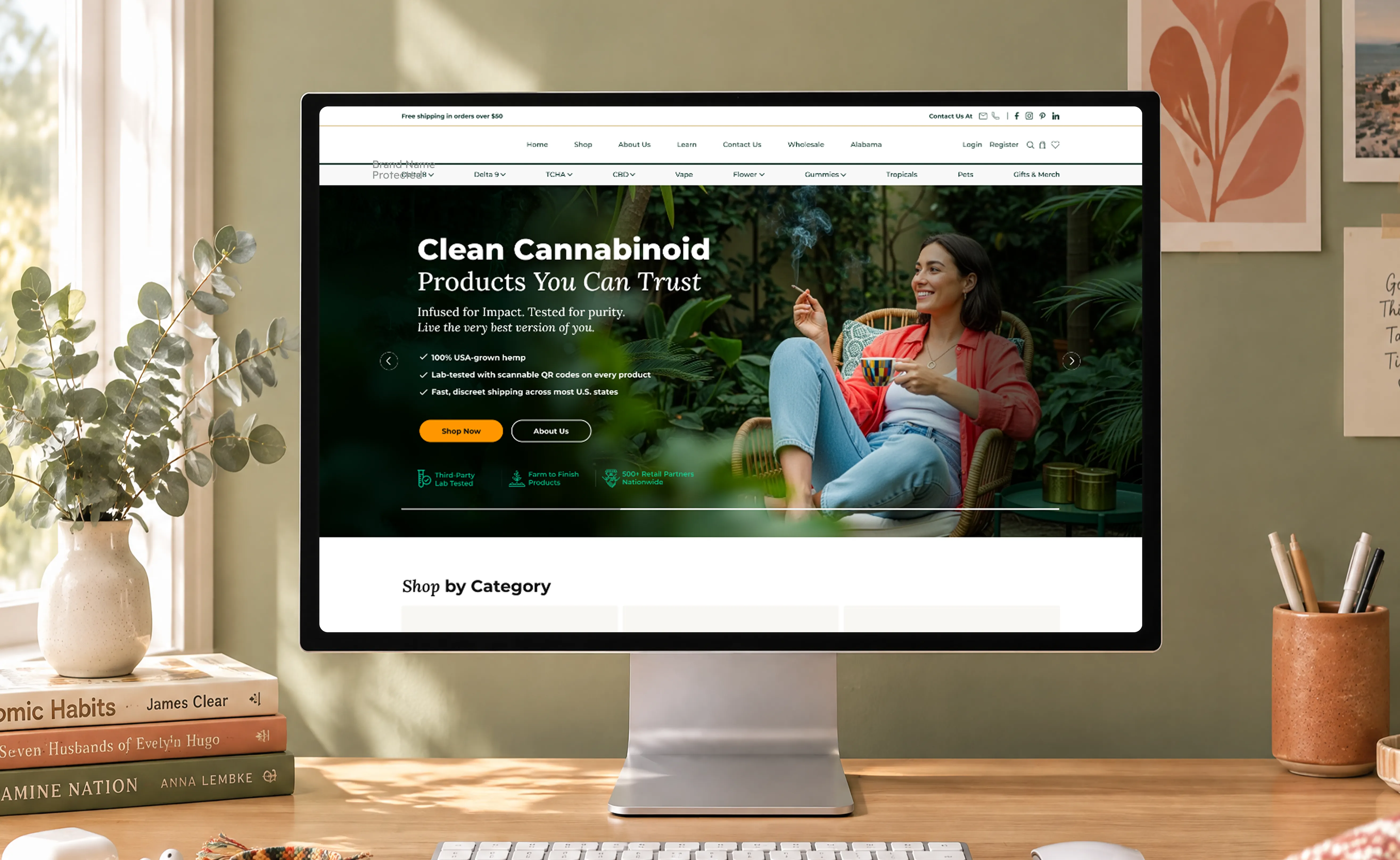
If the site establishes a clear, credible visual identity above the fold — a trust-focused headline, a value proposition broken into three key benefits, and trust badges — before visitors have to scroll, will that reduce the skepticism they bring into a regulated category and carry them further into the funnel, even before social proof appears further down the page?
Home page design
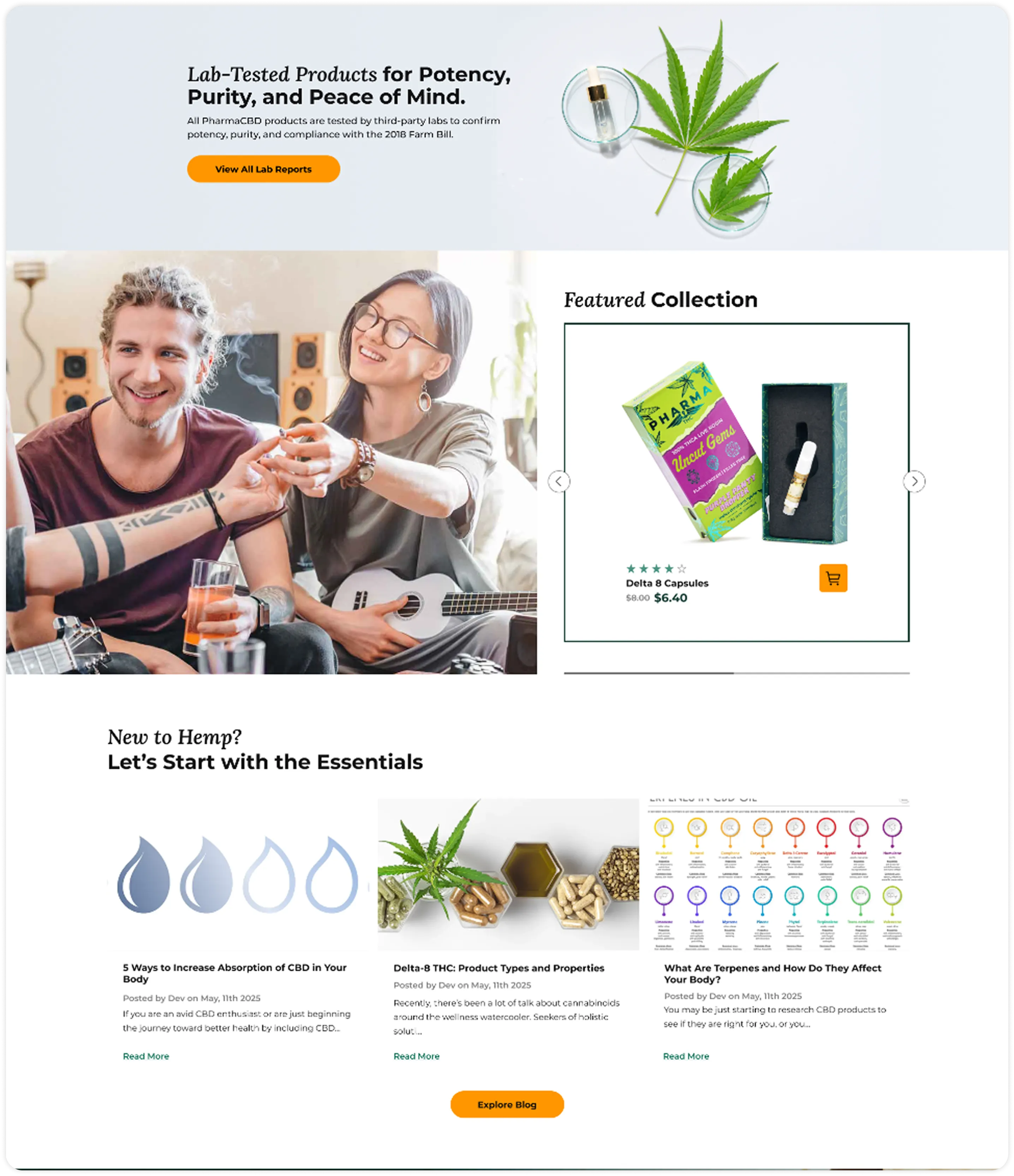
These decisions are built for first-time visitors landing in an awareness stage — still deciding whether the site is worth their trust. Trust badges sit above the fold, right under the CTAs, answering “is this safe?” before the visitor even scrolls. I streamlined the visual hierarchy to prioritize what matters most. Named, rated reviews sit further down the homepage, reinforcing “have others trusted this?” right after visitors browse by category — but before they commit to a specific product.
Product detail page design
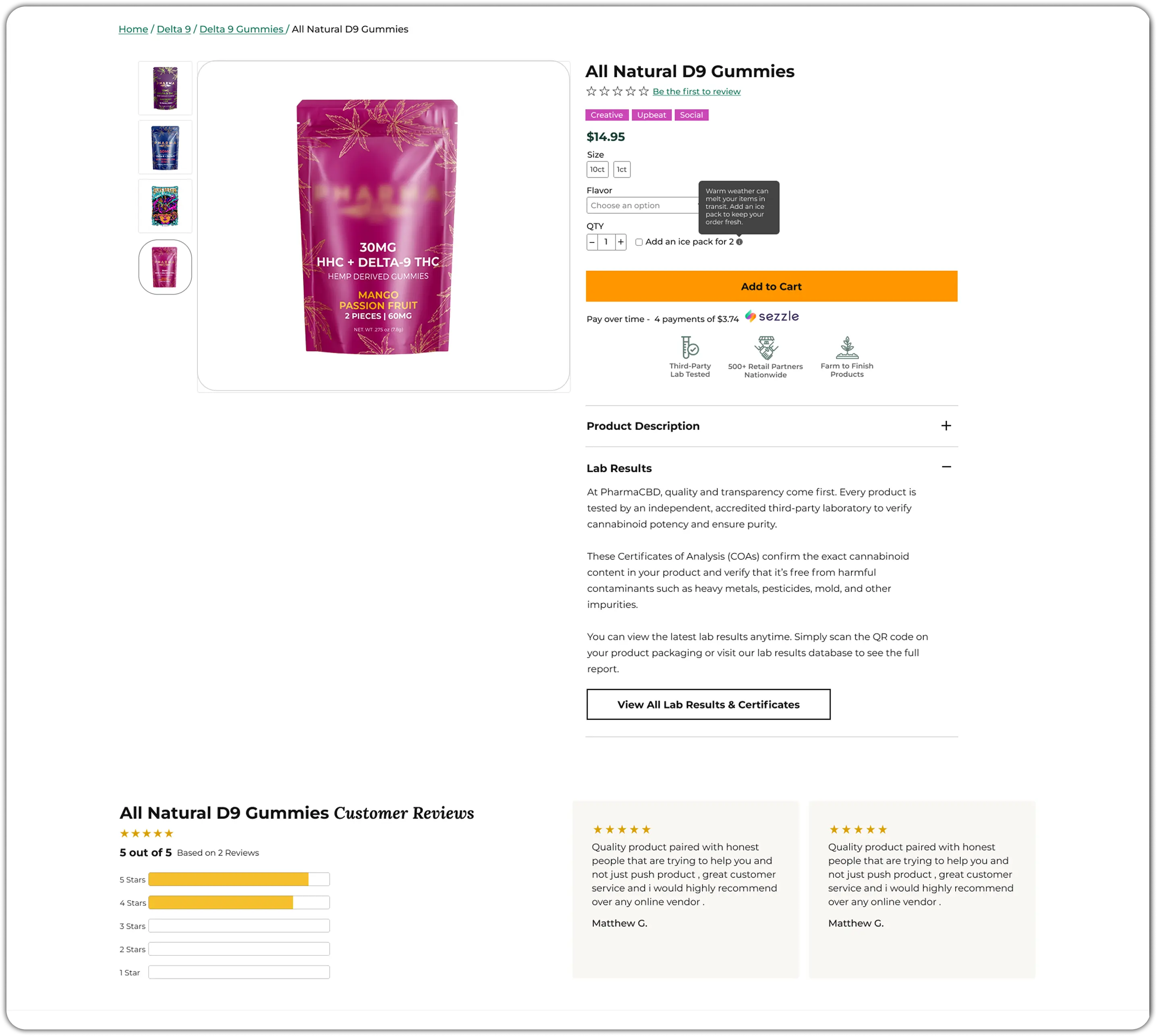
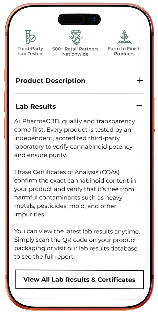
Reviews sit visually close to the product name, answering “will this actually work for me?” right where the buying decision starts. The primary CTA spans the full container width, standing out clearly from every other action on the page — removing any doubt about what to do next. A dedicated Lab Results section, with a direct link to the Certificate of Analysis, turns “is this actually legitimate?” from a claim into something buyers can verify for themselves.
Checkout and payment funnel
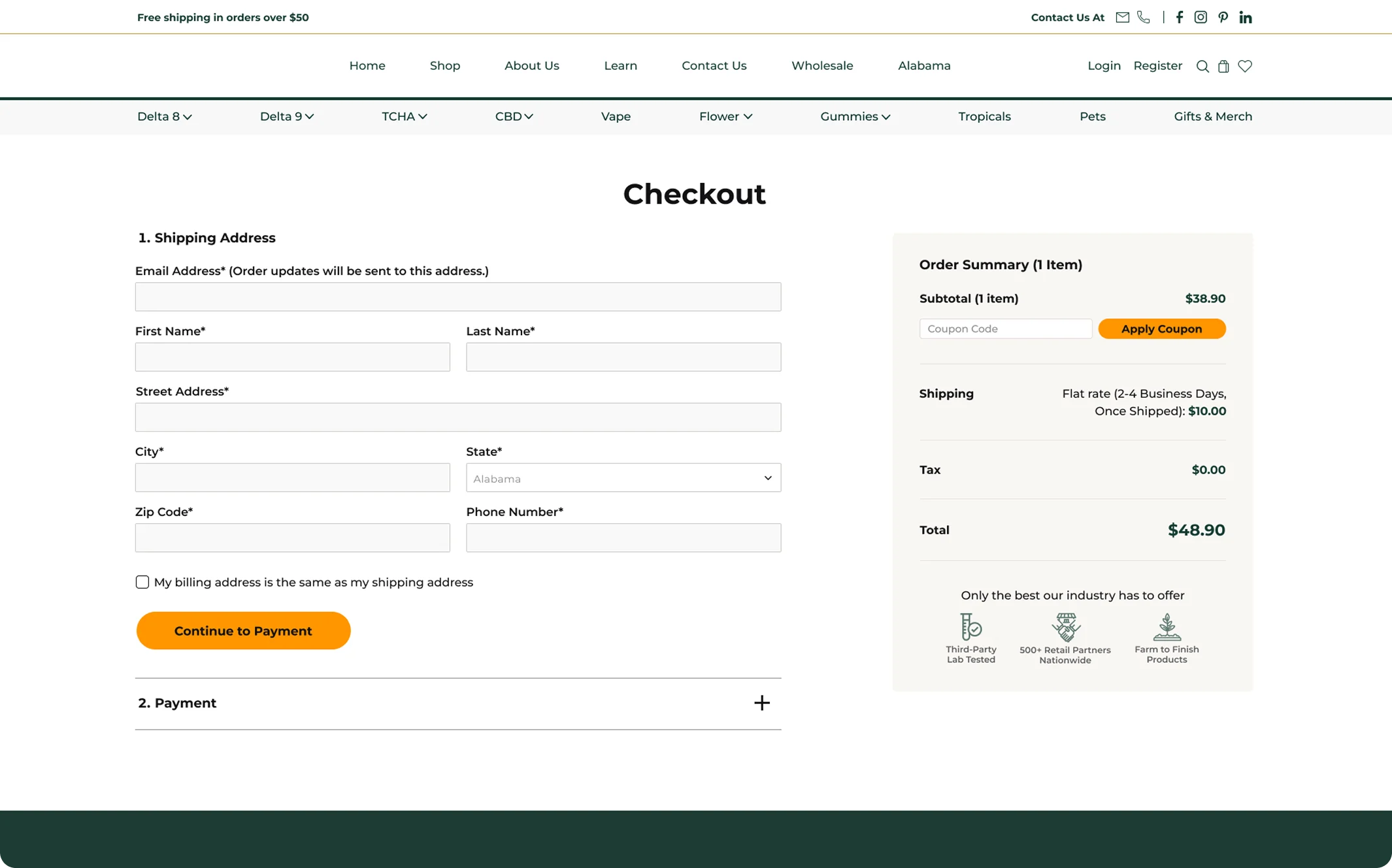
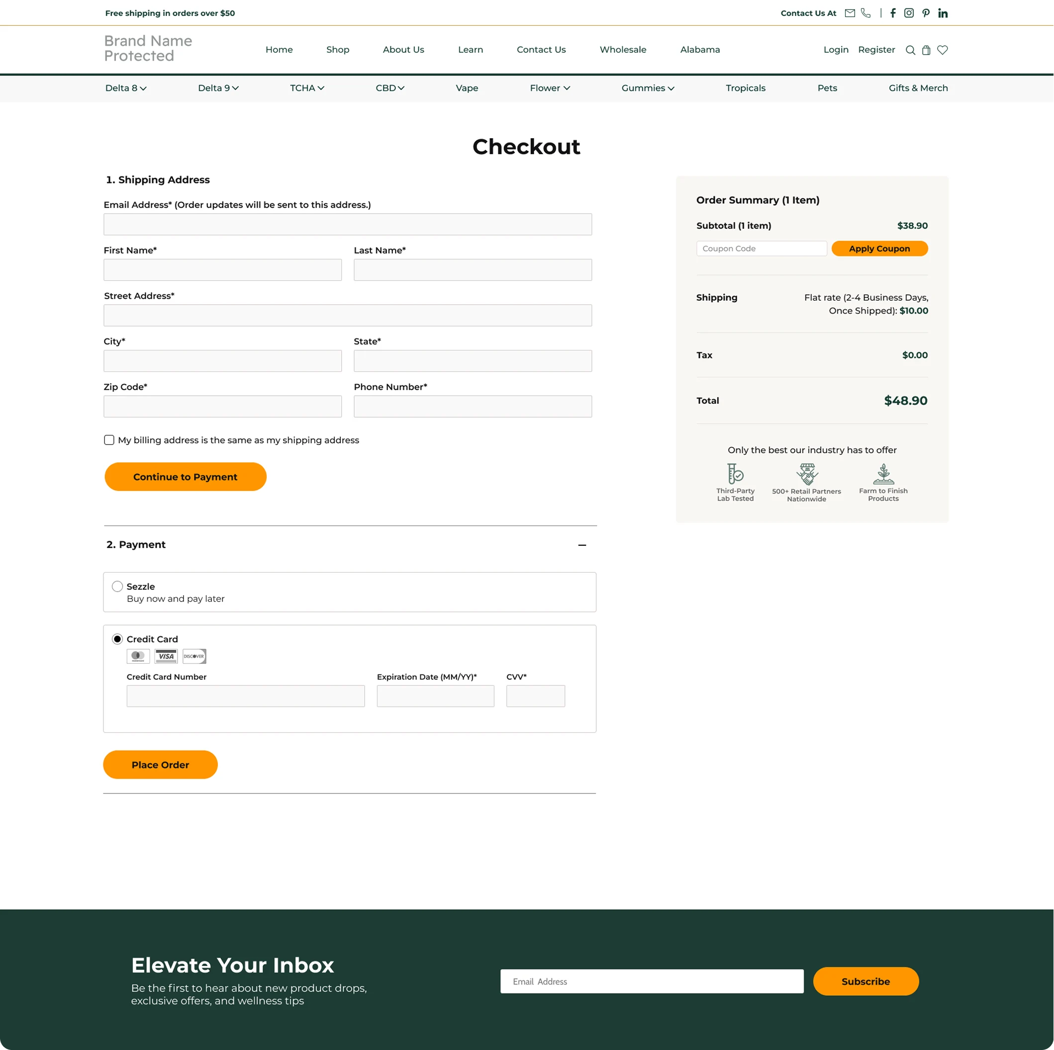
An accordion-style checkout streamlines the process by showing only the necessary information at each step. Trust badges emerge here, reinforcing previous credibility signals.
The “Place Order” button maintains the same orange color used throughout, ensuring a consistent visual cue for action.
My most important takeaways
Visitor and potential buyer trust increases when they know they’re in the right place — where a high-quality lifestyle concept conveys credibility and emotional trust — as well as through a purchase funnel experience where every step reinforces that same confidence, from first browse to completed checkout.
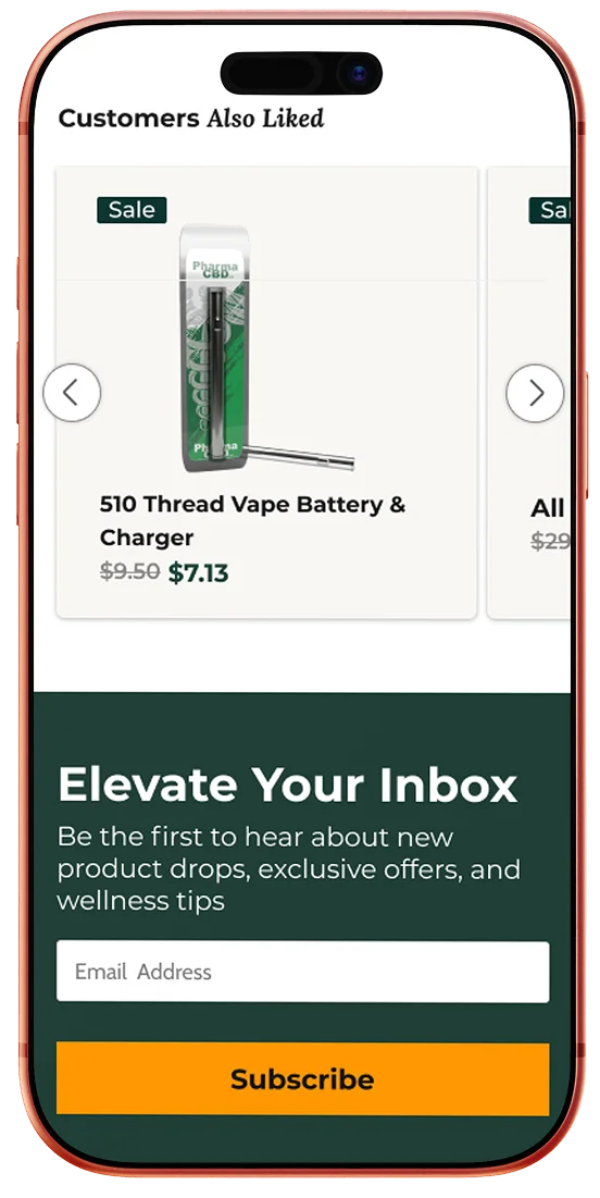
The checkout funnel displays information step by step in an accordion, reducing cognitive load and friction. Form labels sit outside their fields, so the user never loses sight of what information is being requested, while trust badges placed in the order summary keep credibility visible at the final step. Product images were replaced with better-crafted photography, elevating the overall experience, and certificate information is displayed visibly right at the moment of decision.