
Complete web design for a luxury window treatment brand
-
USA

Project overview
The previous site functioned more as a project gallery than a path to purchase — high-quality images with little product focus, and no clear explanation of how to actually book a consultation. For an audience of affluent US homeowners aged 35–60, the vague messaging never told the story of how Drapery Connection could solve what they came looking for, resulting in high bounce and low conversion. My challenge was to turn a static portfolio into a clear, step-by-step path toward booking.
Home page design

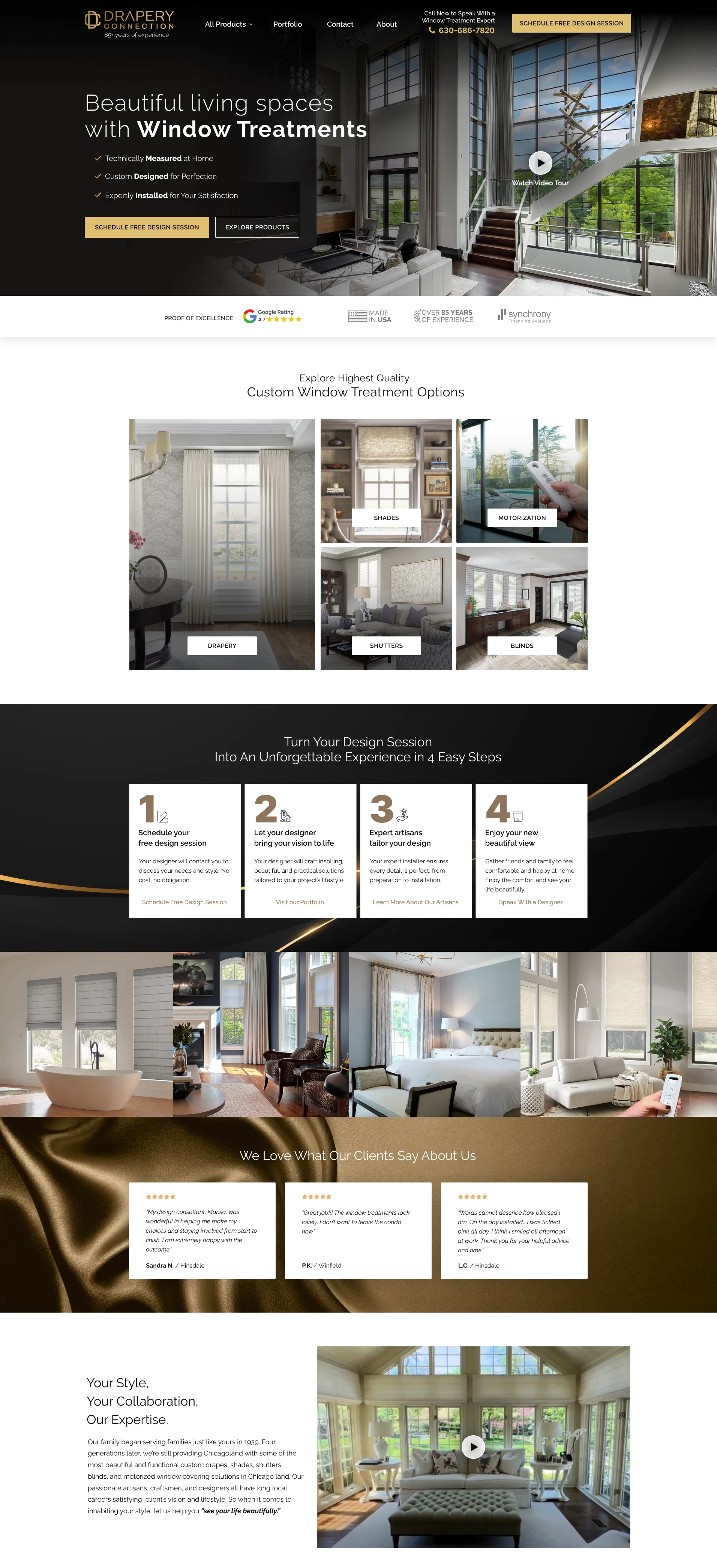
I placed the three key benefits siting right in the hero as an early quality signal, and a trust section follows immediately after, without competing for attention.
High-end imagery drives the entire hero, letting product craftsmanship set the atmosphere rather than relying on copy alone.
When visitors scroll, they see five distinct product categories and a clear 4-step process that sets expectations early, emphasizing trust and craftsmanship in the purchase.
Contact us page design
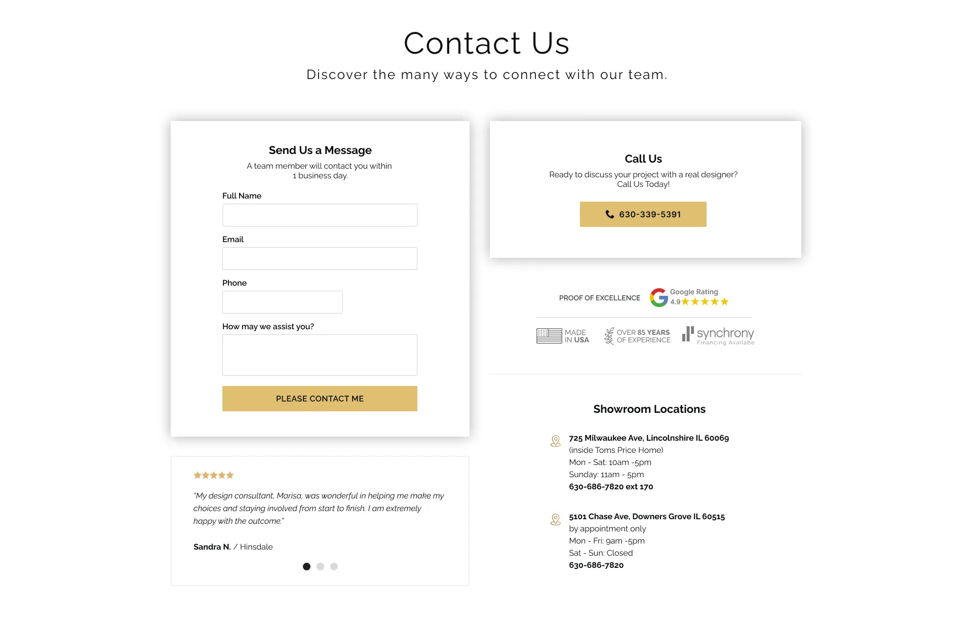
I designed two visually distinct contact options so users can scan in seconds how to get in touch. Trust elements — physical locations, trust badges, and Google rating — sit alongside a testimonial, carefully balanced to support the main content without overwhelming it.
Dev handoff with Claude Code
Given the scale of the project — a full web portal — I used Figma's MCP integration with Claude Code to streamline communication with development. That required disciplined component consistency throughout: proper use of auto layout, variables, and design tokens, so the structure translated cleanly from design to code without ambiguity at handoff.


Results after 30 days, 21,000+ users
Booking Conversion Rate
from 2.0% to 3.2%
How I helped achieve these results
High-end imagery and early quality signals in the hero set the right tone from the first scroll, while a clear 4-step process removed the uncertainty that often stalls custom, consultative purchases. Trust elements: ratings, physical locations, testimonials stayed present throughout without ever overwhelming the path to booking a consultation.