
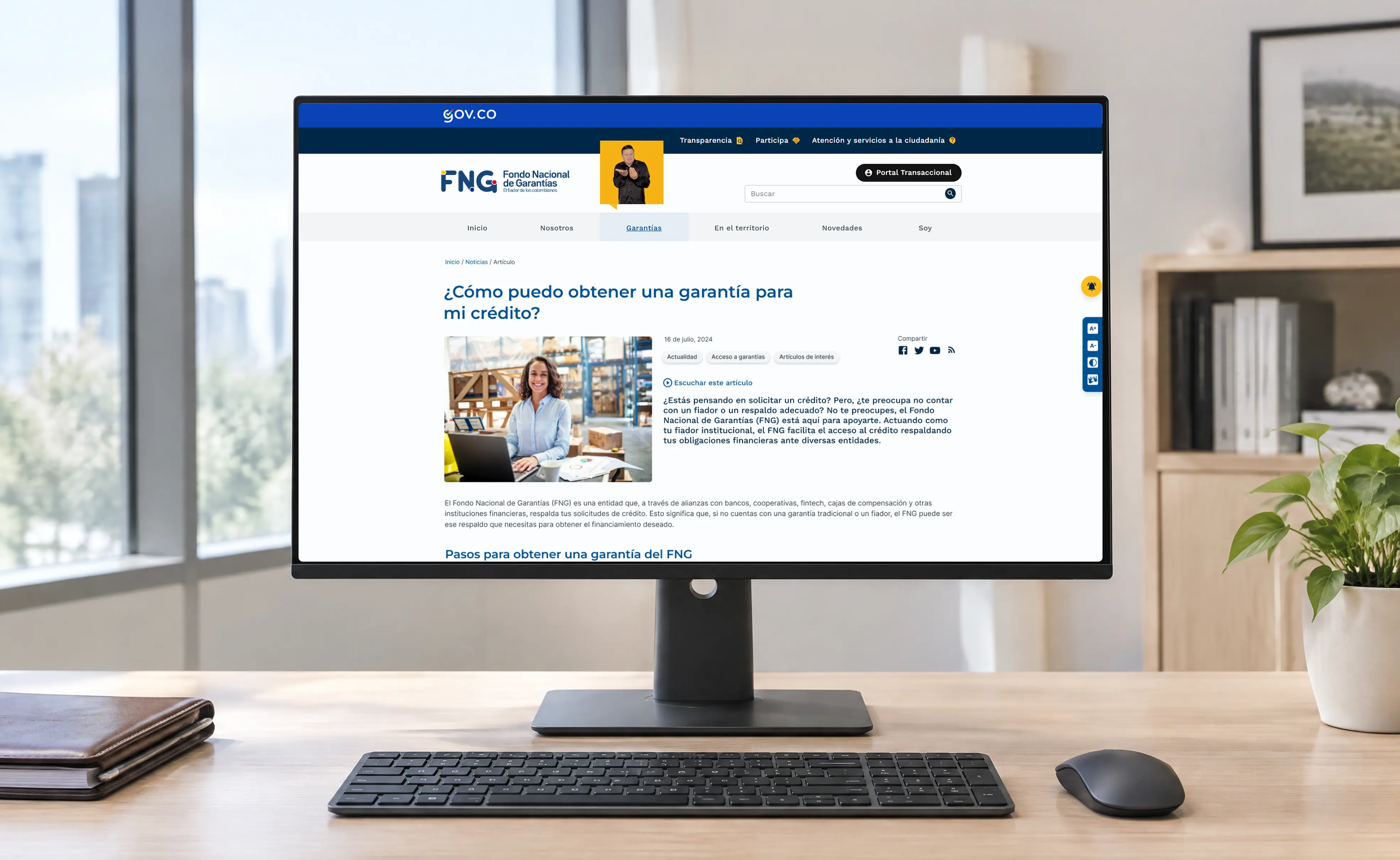
Fondo Nacional de Garantías
institutional & transactional web design
Institutional and transactional portals design for the most important financial guarantee provider of Colombia, two products that made the access to the company products easier and more transparent as well as accessible for the users.
Project overview
This government entity aimed to position itself as the main credit guarantee provider for small and medium companies across the country — simplifying access to service information and making complex financial concepts, like credit guarantees, understandable to the general public. At the same time, the transactional portal had to serve as the single, reliable platform where partner banks processed guarantee requests on behalf of their customers. I managed the entire end-to-end process — from initial research, through building the design system from scratch, to shipping high-fidelity interfaces.
-
Colombia

Research & discovery
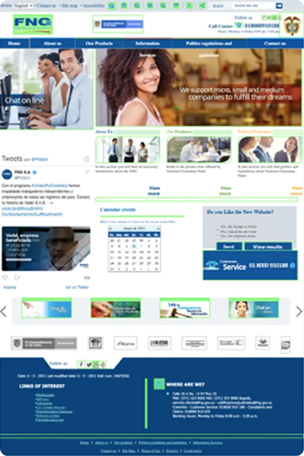
I benchmarked the previous FNG portal and audited it with Google PageSpeed Insights for performance, alongside an accessibility review of color, typography, and hierarchy. The team ran technical workshops to identify functional, performance, and design priorities.
The UX designer led user interviews within FNG, in which I also participated, producing an insights document that became the foundation for everything that followed.
Business and user insights from discovery interviews
 Business and user insights from discovery interviews
-
“The information about what a guarantee is and how to access it is not clear; it should be, just like the mission objective of the FNG”.
(Customer Service) -
“Business owners find it difficult to locate information on lines and benefits”.
(Communications Office) -
“We want access to be more user-friendly, so that business owners have all the ease in paying their obligations”.
(Operations Sub-Director) -
“We're currently receiving calls from financial intermediaries asking us to clarify process information — how their case is progressing and which attachments they need to upload.”
(Customer Service) -
“People often get confused trying to access the transactional portal, expecting to find payment information or a certificate of clearance there.”
(Customer Service)
Information architecture & lo-fi wireframing
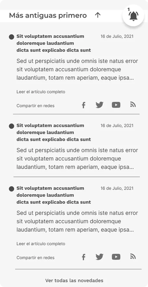
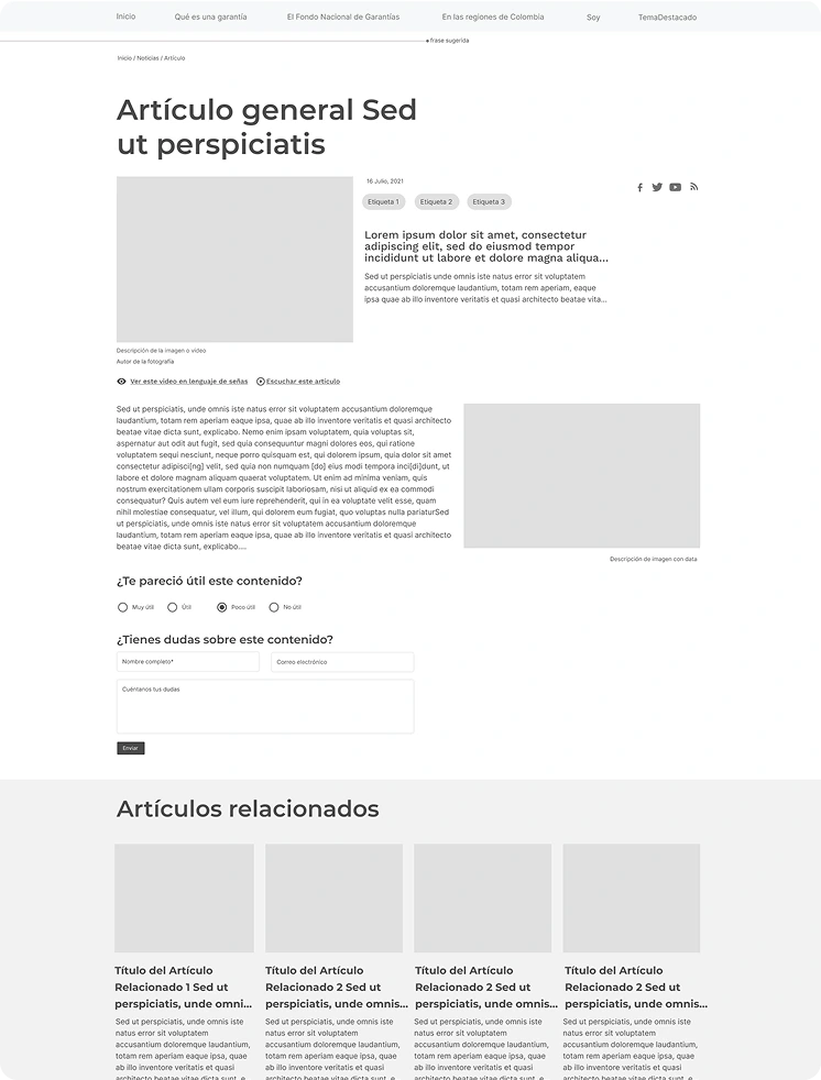
I defined the information architecture and content structure for every section of the site based on the insights that were defined in the first discovery phase. I worked closely with the UX designer on the section-level planning.
As a result of that process the low-fidelity wireframes were designed by the UI team I led and went through review cycles with FNG stakeholders.
Hi-fi wireframing
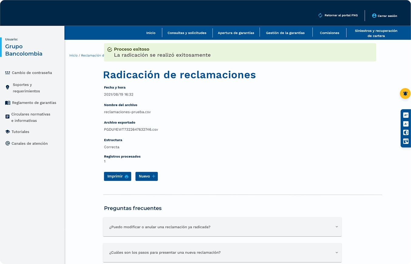
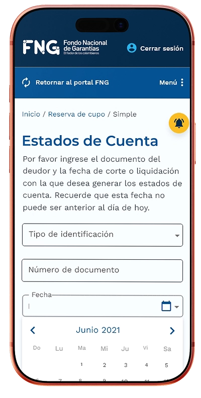
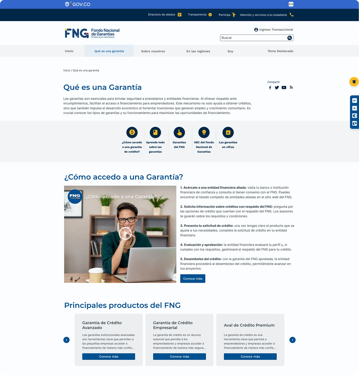
As a result of validation directly with users and FNG's internal stakeholders, the navigation structure and information architecture reached a defined stage. Based on that I designed the final prototypes for each section, while design system documentation continued in parallel.
Accessibility compliance
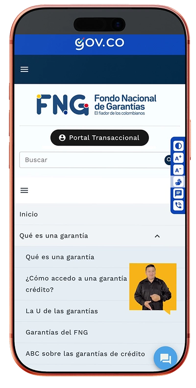
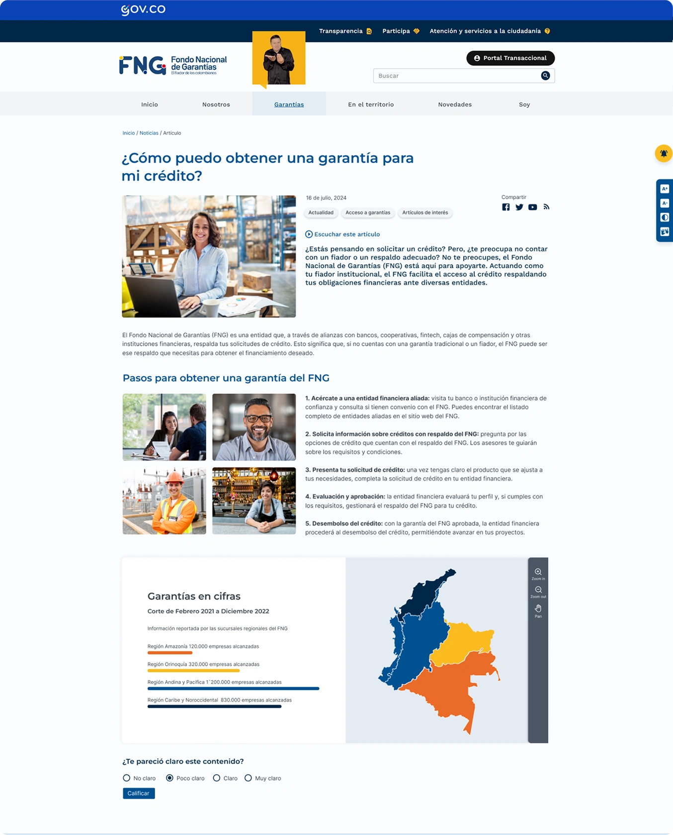
As a result of validation directly with users and FNG's internal stakeholders, the navigation structure and information architecture reached a defined stage. Based on that, and the consolidation of WCAG guidelines, I designed the final prototypes for each section, while design system documentation continued in parallel.
My most important takeaways
Leading FNG's redesign end-to-end meant proving that accessibility, government compliance, and brand clarity don't have to compete with each other — they can be built into the same system from the ground up. The institutional portal now explains complex financial concepts, like what a credit guarantee actually is, in language the general public can follow, while the transactional portal gives financial partners a simpler, more secure path to file claims.
The project shipped and was approved by FNG across both the institutional and transactional portals, with a design system documented well enough for developers to build from — even under real time constraints that required practical trade-offs along the way. What stayed non-negotiable throughout: accessibility wasn't treated as a checklist item, but as a constraint the entire visual system — color, typography, video content, navigation — was built around from day one.