
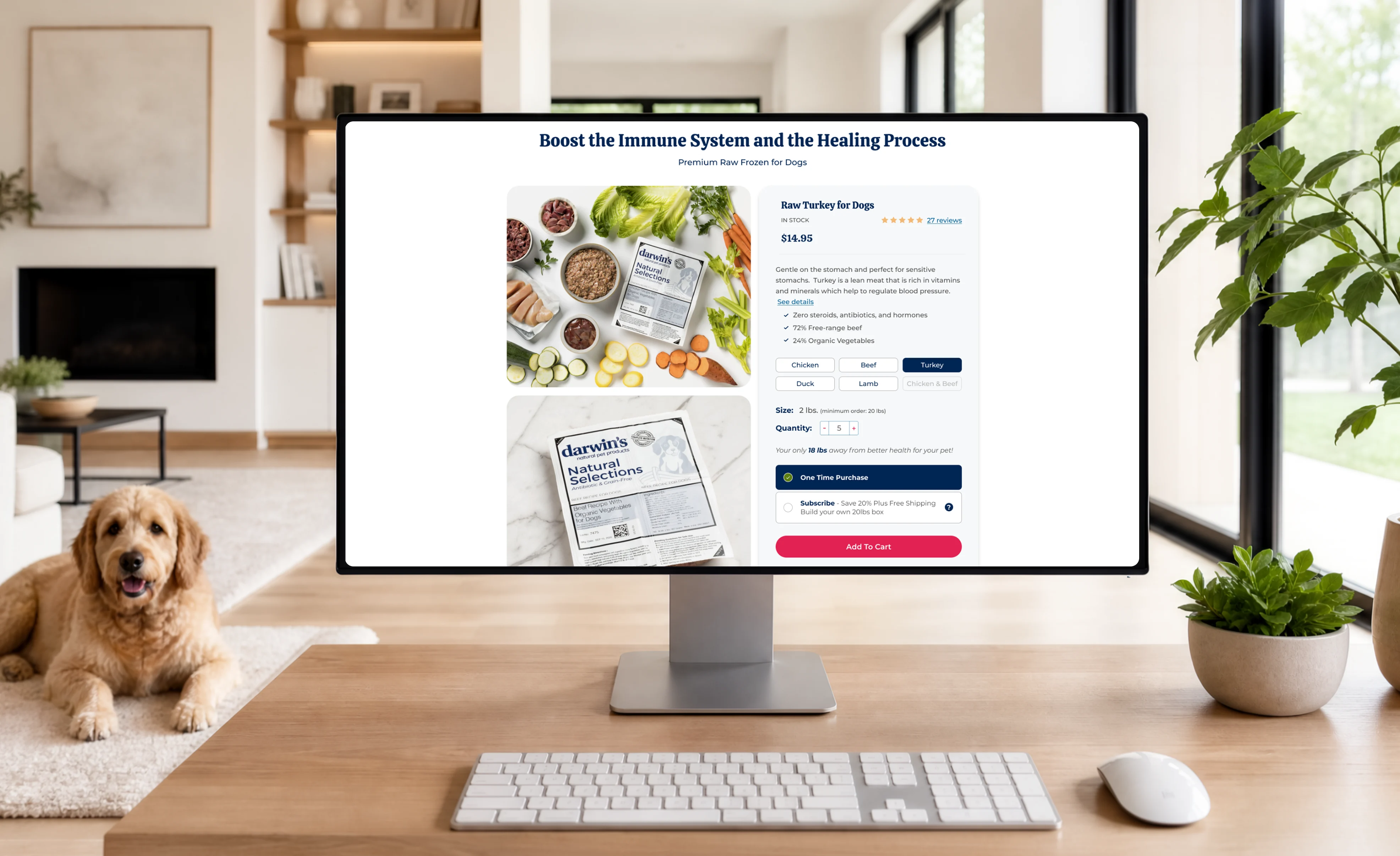
Pet food e-commerce web page redesign
A DTC brand selling raw pet food in the US. The checkout, homepage, and product detail page work together as one experience that bridges the gap between visitor and business — answering the visitor's questions and building trust from the very first interaction, with an emotional touch throughout.
Results during one month of testing
Session conversion rate increased: +15.9%
Orders lifted: +25.9%
Project overview
Raw pet food is a high-consideration purchase. Visitors landing on the site needed three questions answered immediately to build trust: Am I in the right place to start feeding my dog raw food? What do I actually gain by buying here? Have other dog owners had a good experience with this?
I designed an experience that answers those questions before hesitation sets in — lower pricing through a subscription model built for users who buy repeatedly (not one-time purchasers) and are ready to commit in exchange for a better rate, one consistent, action-oriented voice across every page, and features and benefits surfaced exactly when they're relevant to where the visitor is in their journey, cutting cognitive load instead of adding to it.
-
USA

The problem
Quantitative data from GA4 revealed a high exit rate on the product detail page — visitors browsed the PDP without completing a purchase. Homepage scroll depth was also low. A heuristic review of the current page pointed to the root cause: the content wasn't engaging enough, and visitors weren't finding clear value early on — giving them no reason to keep scrolling or move toward a purchase.
Hypothesis
If visitors see clear, trust-building value above the fold — before they have to scroll or dig for it — will they engage more deeply with the homepage and carry that trust into the PDP, reducing exit rate and increasing purchase intent? And for returning customers, does clearly communicating the subscription pricing benefit give them a concrete reason to commit, rather than buying once and leaving?
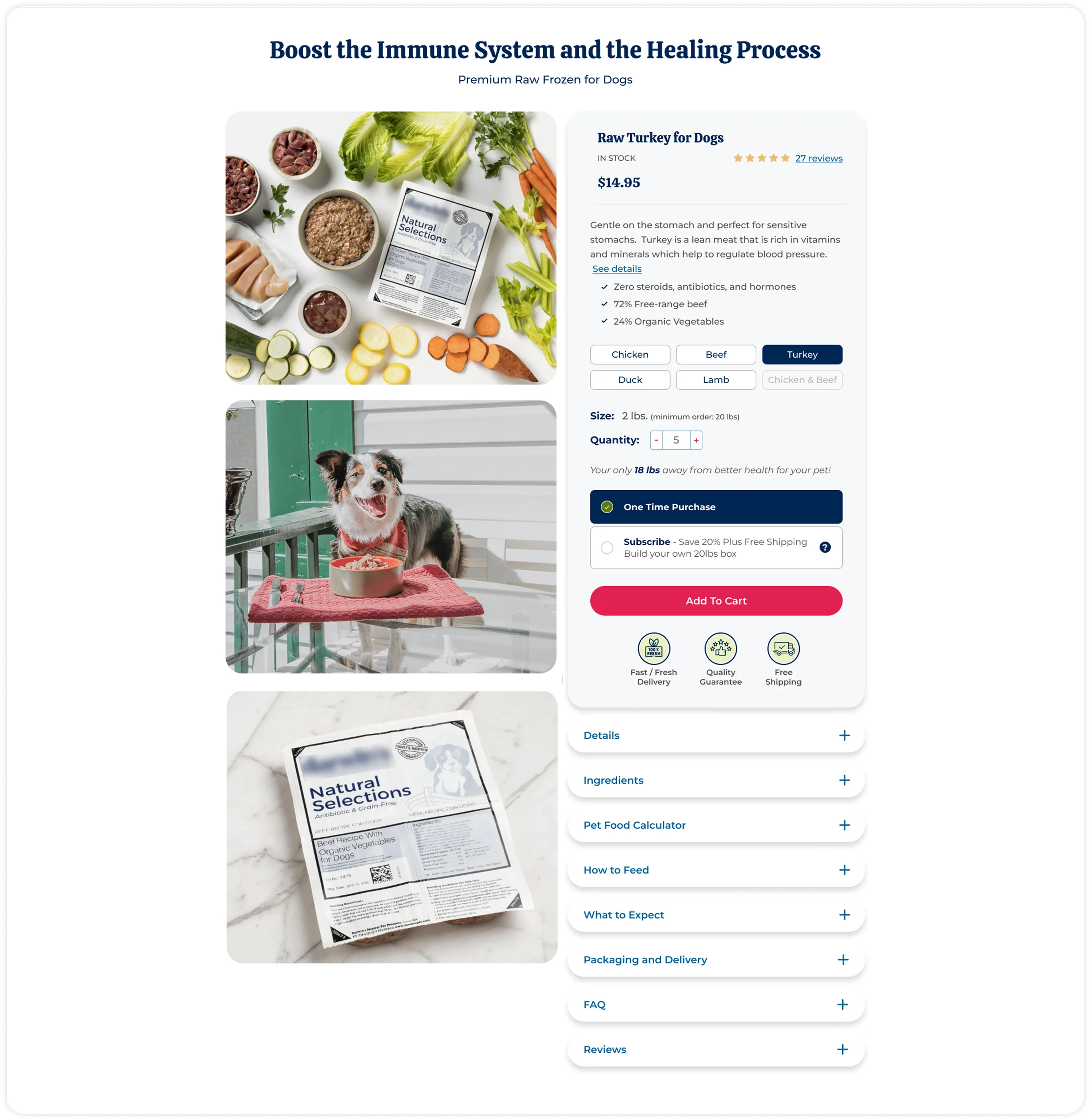
Product detail page design
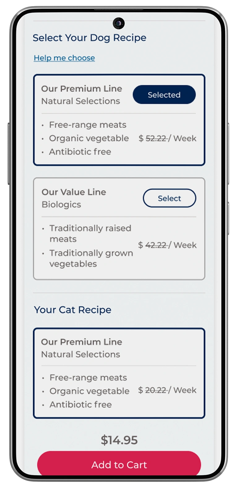
The flavor selector's active state removes ambiguity at the exact moment visitors compare options — a small decision, but one that reduces hesitation on a purchase visitors were already uncertain about. Benefit checkmarks answer “what do I gain” without pulling attention away from the single next step: a full-width Add to Cart button. Photography shows pets actively enjoying the product, because a static product shot can’t answer “will my dog actually take to this?” — social proof throughout the page closes the last trust gap: “have other owners had a good experience?”
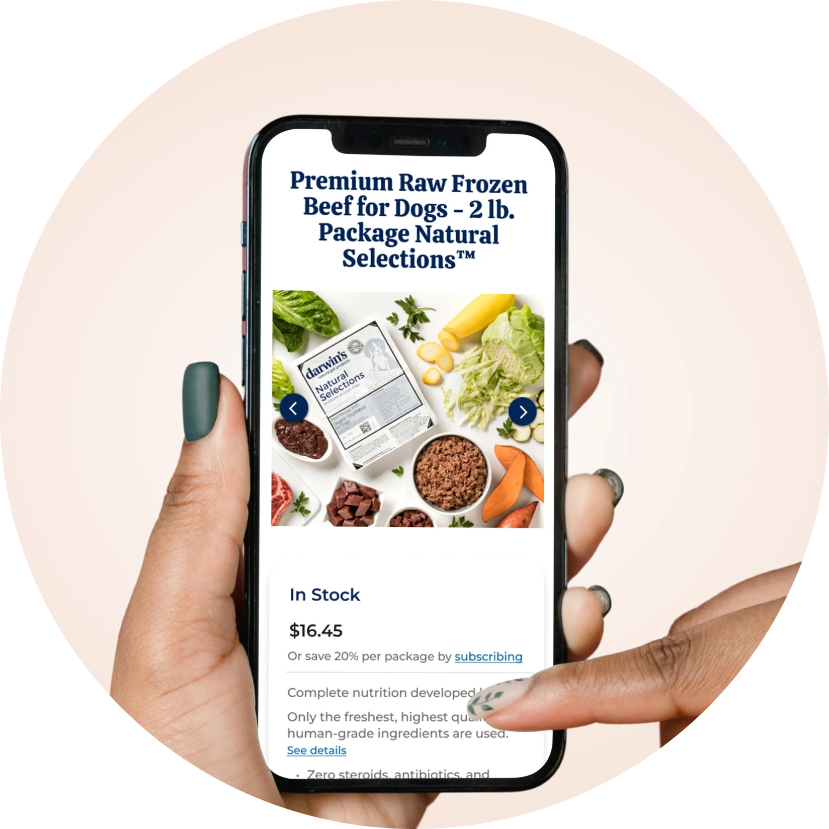
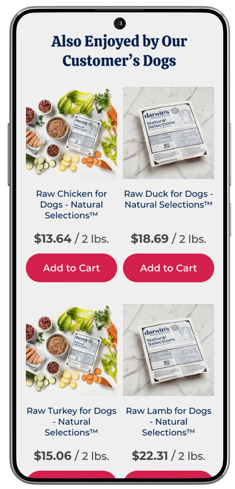
Mobile pages design
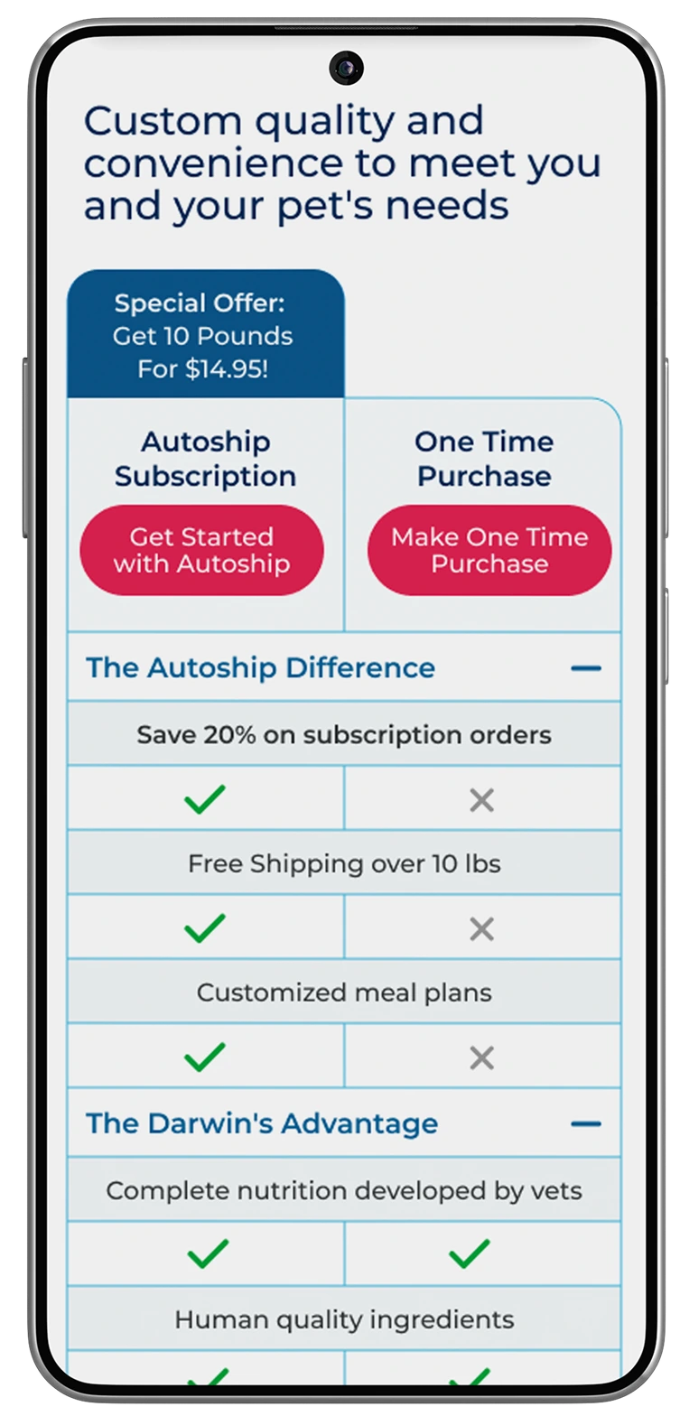
Mobile keeps the same trust signals as desktop, with less friction: the diet selector collapses into one thumb-friendly step, the full plan comparison adapts to a vertical scroll instead of side-by-side columns, and personalization stays inline so users can customize and buy without leaving the flow.
Quiz-based subscription flow page
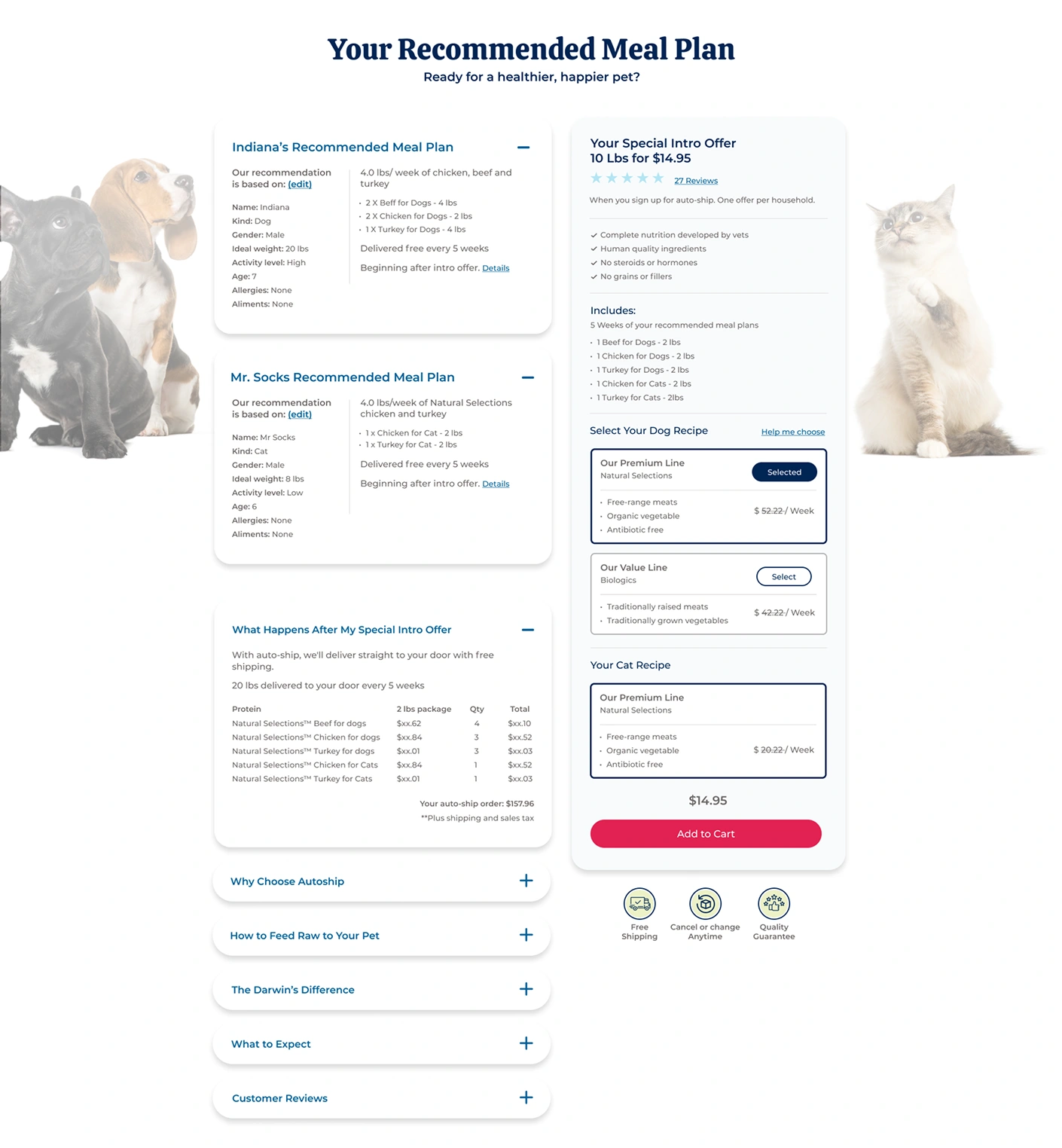
We created a personalized meal plan that caters to both hesitant and loyal users through a feature that generates the exact food formula and serving size tailored to their pet's size, sex, breed, and overall health conditions. This functionality raised the sense of trust and care — buyers aren't only purchasing food, they're concerned about their pet's health and are looking for ways to extend their lives. They're buying well-being and peace of mind, and this functionality gives them direction, guiding them toward their pet's specific dietary needs, which solves a recurring concern for pet owners: how to start feeding MY pet according to their specific conditions.
On top of that, the subscription model made it easier to sustain engagement, rewarding clients with lower prices for continued purchases over time, plus an auto-ship benefit where clients simply pay and the brand manages the monthly shipment for them. An introductory price of $14.95 for 10 lbs — a standout promo — sits prominently near the CTA, lowering the barrier to that first commitment.
Subscription page design
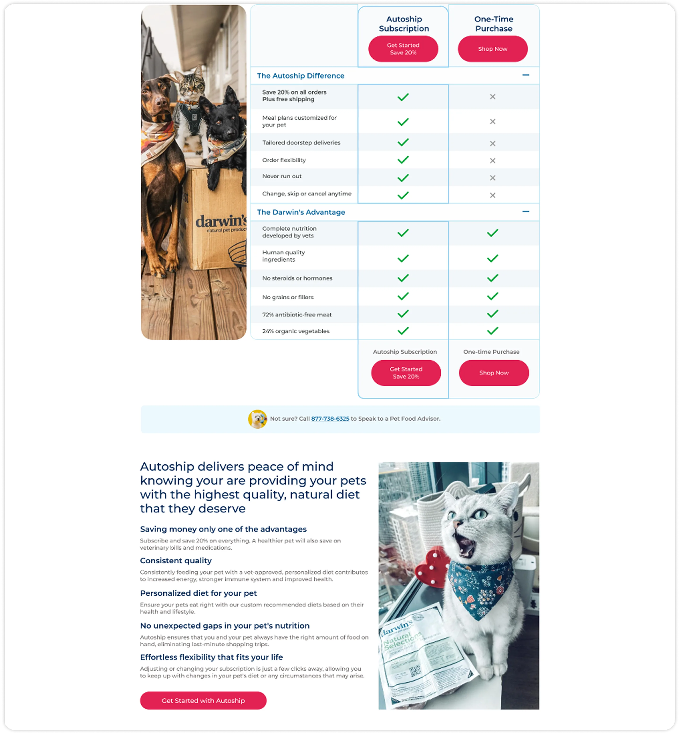
A side-by-side table makes the subscription's benefits explicit — 5 extra perks (20% savings, customized plans, flexible delivery) checked off against the one-time option. Both CTAs stay visible, but visual weight clearly favors Autoship. A “Call a Pet Food Advisor” note sits right below the table, offering reassurance at the moment of comparison fatigue.
My most important takeaways
Moments where trust is decisive to the purchase decision are backed by consistent CTAs, making it clear where to interact. Product benefit information is delivered without ambiguity, right where confusion would otherwise cost the sale.
Understanding how the business handled its online sales — and the difficulty of simplifying its subscription process — was key to defining a simpler, clearer path for pet owners who needed, in turn, to trust the simplicity and transparency the purchase experience could offer. A raw pet food diet requires a trustworthy brand experience, one built through transparency, considered imagery, and usability principles that kept every step of the decision clear and easy to follow.