
D2C handcrafted lighting store on Shopify
Homepage, collection pages and product detail page design for a DTC brand of handcrafted rattan lighting in the US, three page types that made a catalog of 120+ products navigable by room and need, and gave visitors what they needed to buy a piece they can only see on a screen.
Results during one month of testing
Bouncing rate: Dropped by a 15%
Orders lifted: 20%
Project overview
Rowabi is a DTC brand selling handcrafted rattan lighting in the US, running on Shopify. The catalog had grown to over 120 products across dozens of categories, but the site gave visitors no way to navigate that scale — and product pages showed little more than lamps and prices for a piece people can’t touch, hold up to their wall, or judge for size before buying. I redesigned the homepage, collection pages and product detail pages, restructuring the catalog around how people actually shop for lighting — by room and by need — and building the product page to answer what a photo alone never could.
-
USA

The problem
Rowabi’s catalog had grown into dozens of categories, but the site didn’t organize them in a way people could navigate. Finding a light by need or by room wasn’t easy, which hurt discoverability and left most visitors abandoning the homepage without going deeper. The design also felt dated and didn’t do justice to a handcrafted product: product pages showed little more than lamps and prices, with no detailed information and no proof of how the lights actually look and feel in someone’s home.
Hypothesis
If the homepage organizes the catalog the way people actually shop for lighting — by room and by need — instead of leaving them to work through dozens of categories on their own, will more visitors move past the homepage and into a product page?
And once they get there: if the product page answers what visitors can’t check in person — how the light looks in a real home, how big it is, how it installs, when it arrives — will that give them enough confidence to buy a handcrafted piece they can only see on a screen?
Home page design
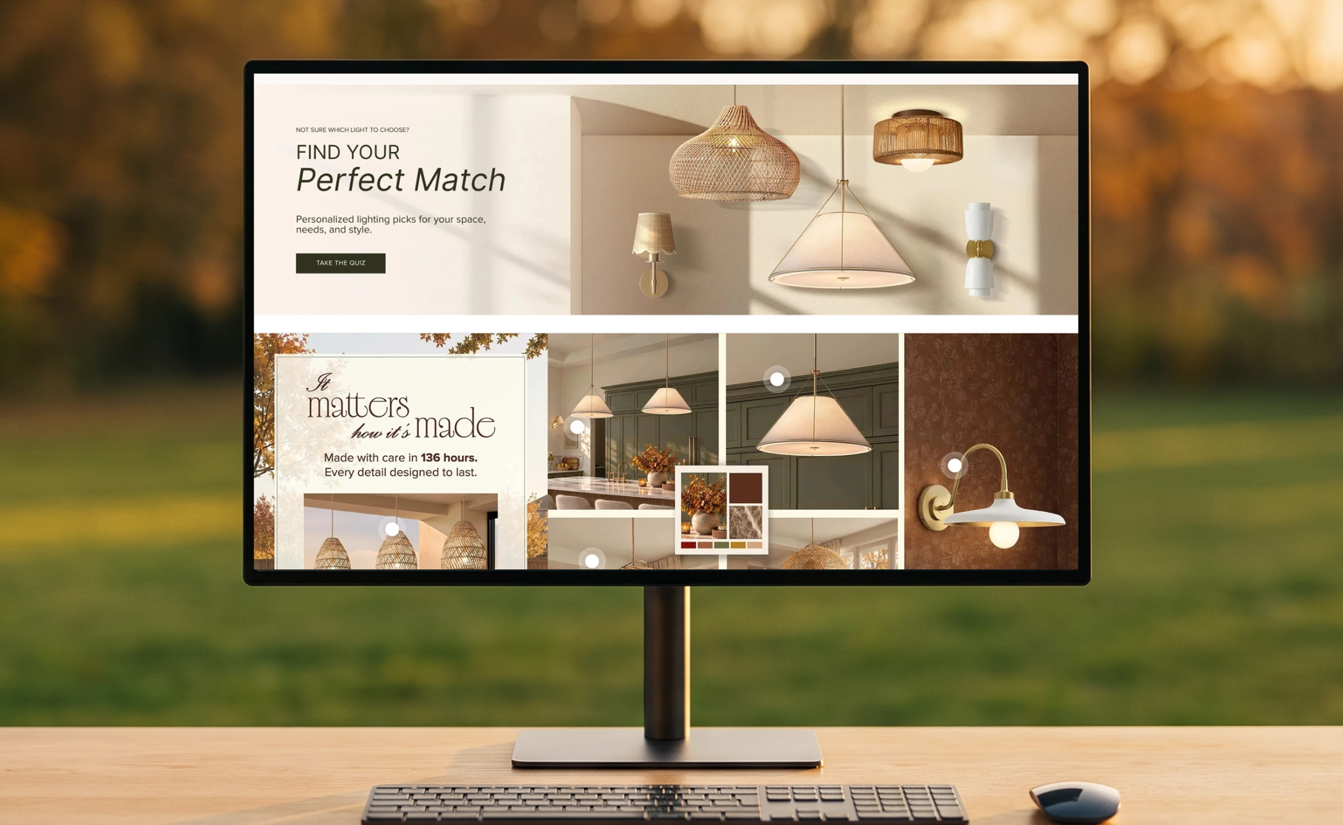
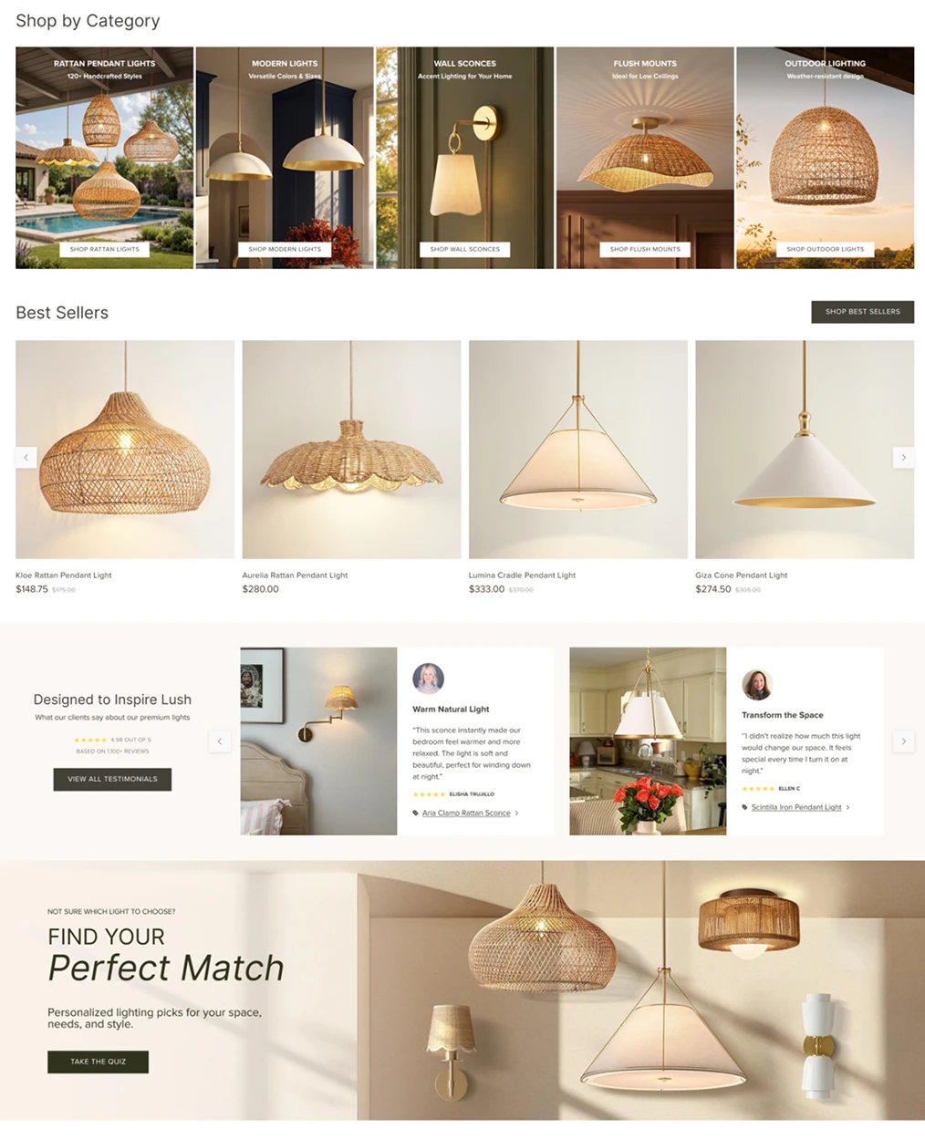
The homepage is built around four visitors at different levels of certainty, so no one reaches a dead end. Category cards carry a functional descriptor rather than just a name — “Ideal for Low Ceilings”, “Weather-resistant design” — turning a list of 120+ products into a filter by real situation for the visitor who already knows what they need. Best Sellers give a starting point to the one who doesn’t, with prices visible so budget expectations are set before the product page. Testimonials answer the question that actually blocks a décor purchase — will this work in a space like mine? — with photos of real rooms, named faces and a direct link to the product, turning social proof into a path rather than decoration. And the quiz catches whoever is still undecided, guiding them by space, need and style instead of letting them leave — which was exactly what the previous homepage couldn’t do.
Product detail page design
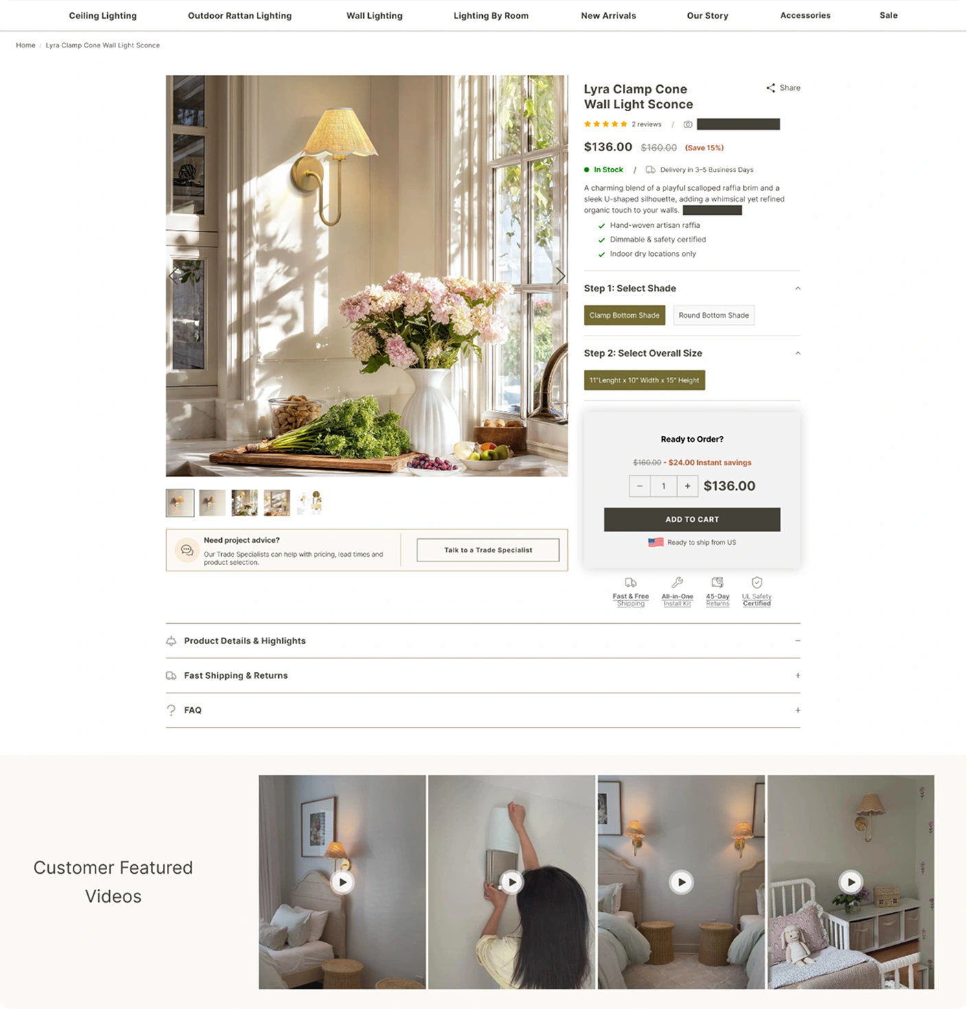
Buying a handcrafted light online means committing to something you can’t touch, hold up to your wall, or judge for scale — so the page is built to close that gap. Reviews sit under the product name so trust comes first, and three checkmarked benefits answer the doubts specific to this category before they become reasons to leave. The configurator breaks a complex choice into numbered steps, with stock and delivery time next to the price, because uncertainty about when is its own barrier to buying. The real differentiator is proof of use: customer videos show the light installed in real homes, answering what no product photo can — how it actually looks on a wall, and whether someone like me can hang it.
Navigation design
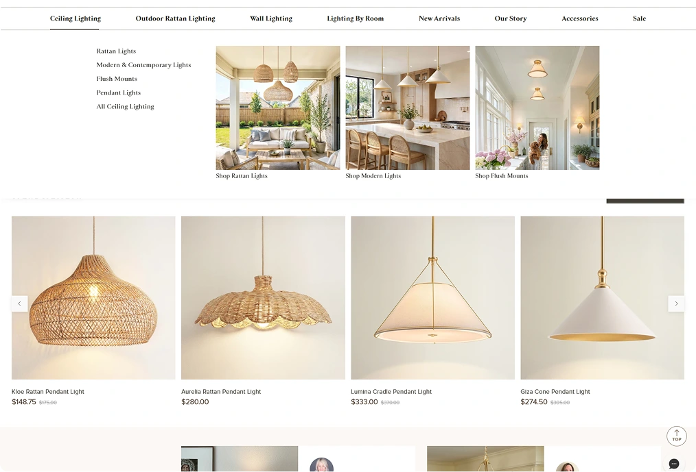
Most people don’t know what a flush mount is, or whether it’s what their hallway needs. Pairing each subcategory with a photo of the light installed in a real room turns navigation into a recognition task instead of a vocabulary one — visitors point at the space that looks like theirs. It also moves the decision into the menu itself, so they reach a collection page already knowing what they’re after.
Collection page design
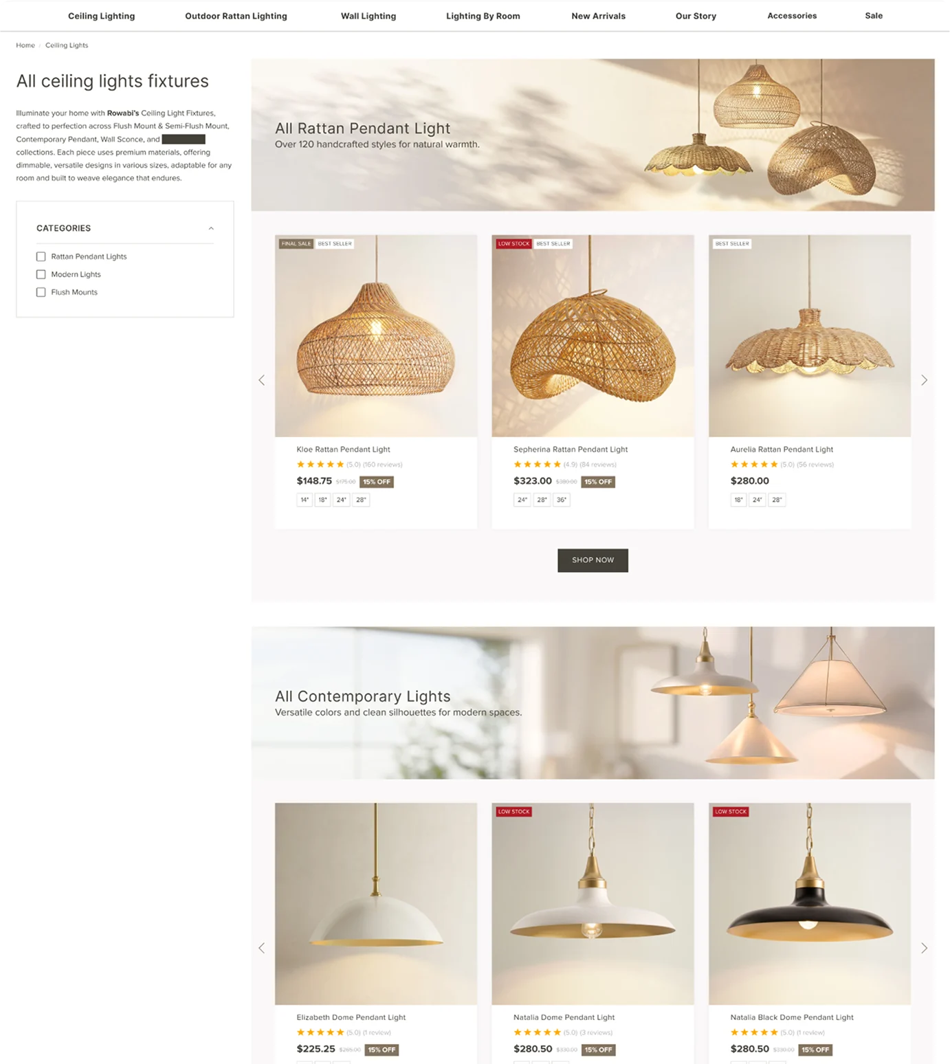
Instead of one endless grid, the catalog splits into three labeled sections, each with a banner explaining who it’s for — “perfect solution for your low ceiling” — so someone who doesn’t know the terminology can self-select before scrolling. Each card carries what decides the next click: rating, strikethrough price and available sizes, so nobody opens a product page to find it doesn’t come in their size.
My most important takeaways
Discoverability wasn’t about filters, it was about language. People shopping for lighting don’t think in product categories, they think in rooms and spaces, and once the site started speaking that way the catalog stopped feeling overwhelming. On the product page I learned something else: for a product you can’t touch before buying, a better photo doesn’t convince anyone. Seeing the light hanging in someone else’s home does.