
Multi-brand D2C
e-commerce web design
A D2C business selling high-quality sportswear for men and women, where dozens of brands, clubs, and products coexist on a single e-commerce site. Users come looking for something specific, so clear categories were essential to help them find it fast.
Results during one month of testing
Session conversion rate increased: 3.16%
Orders lifted: 11.4%
Project overview
Soccer Wearhouse is a real e-commerce store selling jerseys and gear from dozens of clubs and leagues around the world. With that much variety, visitors need to move from “browsing everything” to “finding what they came for” quickly — without the catalog feeling like a maze. I focused on the homepage, navigation, and product detail page, bringing clear structure to a genuinely multi-brand catalog.
-
USA

The problem
Soccer Wearhouse’s catalog spans dozens of clubs and leagues, but the site struggled to bring that scale together coherently. My focus was on the homepage, navigation, and PDP, bringing structure to a genuinely multi-brand catalog.
Hypothesis
If the homepage, navigation, and PDP give clear structure to a catalog with dozens of clubs and leagues — instead of leaving visitors to figure out that scale on their own — will this make it easier to find a specific product, and help more visitors go from browsing to buying?
Home page design
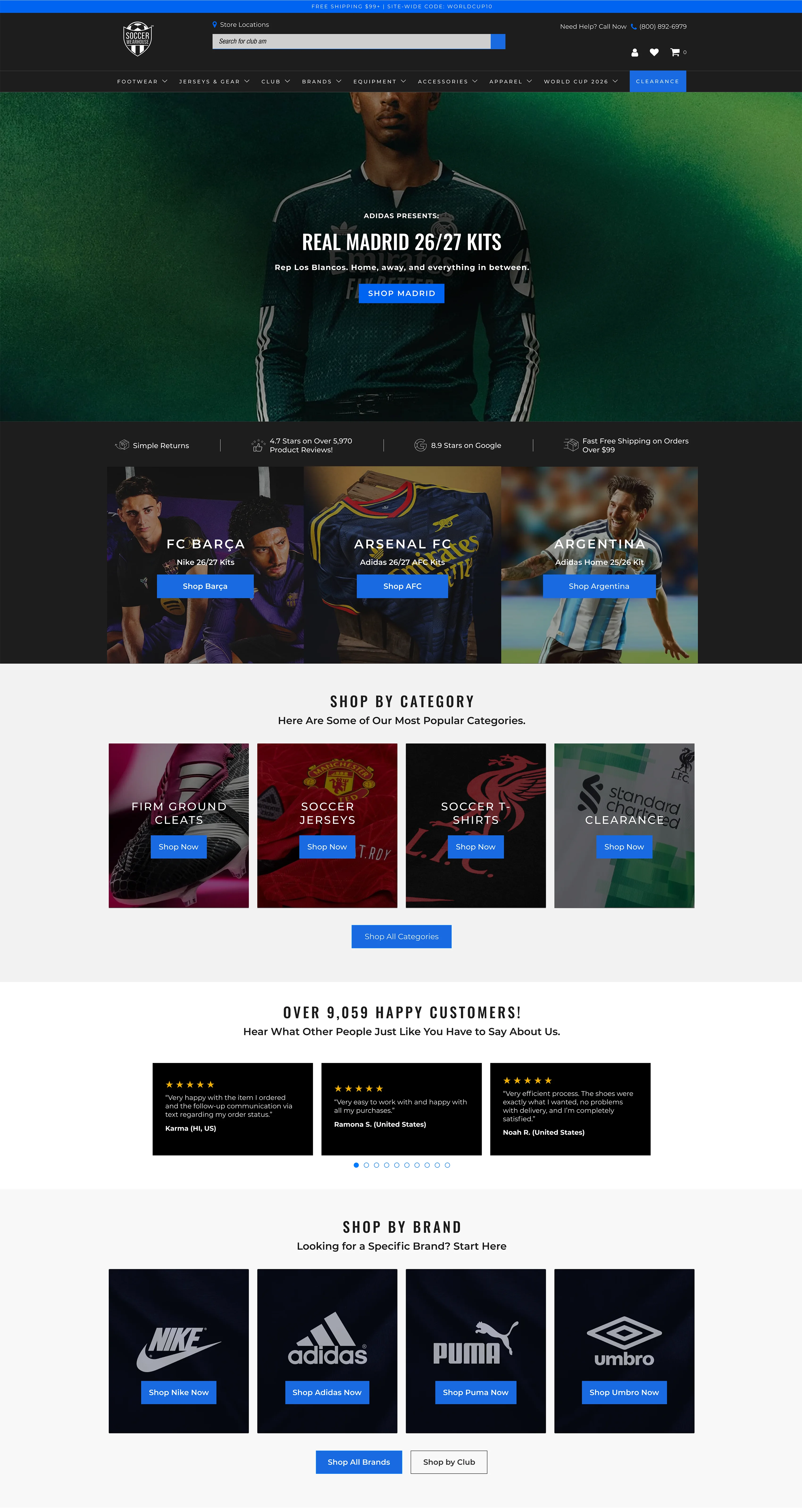
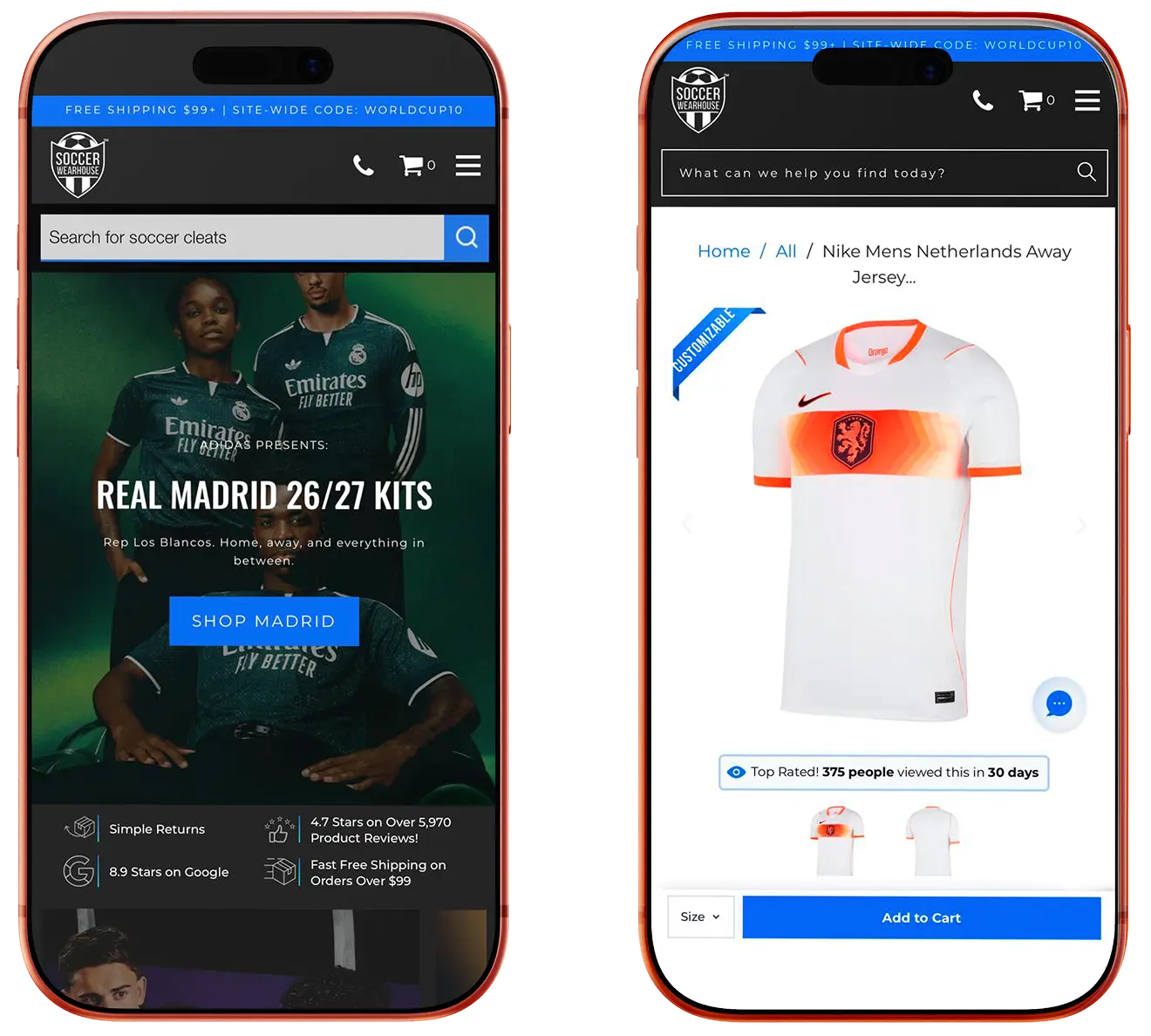
Navigation was restructured around how visitors actually think about the catalog — by league and club first, not by product category — so a visitor looking for a specific team never has to guess where to start. Featured clubs and current promotions sit above the fold, giving the homepage an entry point for visitors who don’t yet know exactly what they want, while clear category paths serve the visitors who do. This balance — guiding the undecided without slowing down the decided — was the core of the homepage’s CRO logic: reduce the scale of the catalog to a manageable first decision, not eliminate the scale itself.
Product detail page design
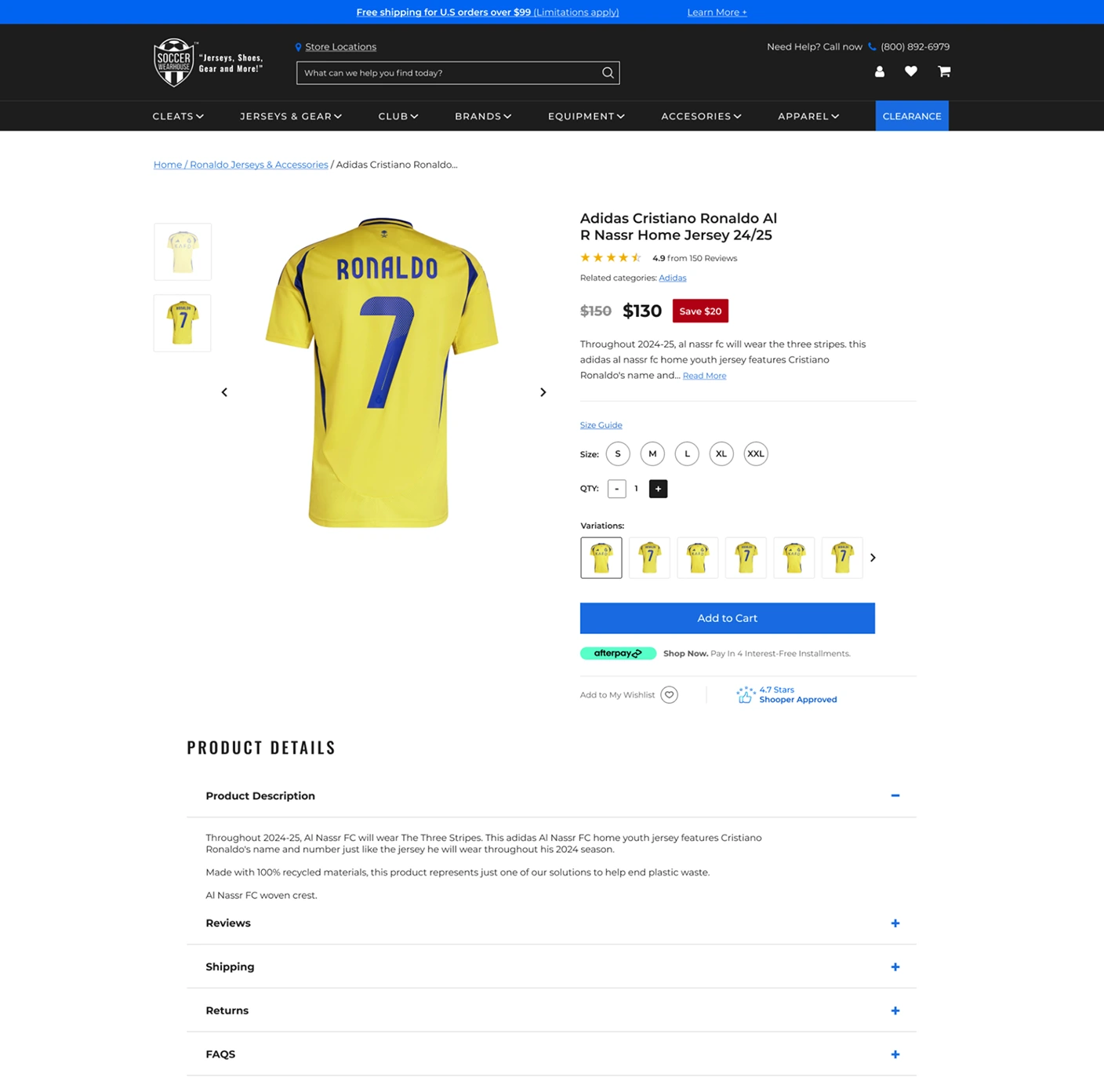
Reviews sit right under the product name, establishing trust before the description. Strikethrough pricing gives the discount concrete weight, while the “Shopper Approved” badge and Afterpay financing near the CTA address two hesitations at once: legitimacy and affordability. Social proof carries into “Customers Also Bought” and “Recently Viewed,” following the visitor into every next decision.
My most important takeaways
Designing for a multi-brand catalog taught me that structure matters more than decoration when scale is the real challenge — the navigation and homepage had to do the heavy lifting so visitors never felt lost among dozens of clubs and leagues. It also reinforced how much a clear PDP layout can carry once a visitor has found what they’re looking for: getting them there is only half the job.